The Psychology of Color in Web Design

The Psychology of Color in Web Design

Explore how different colors can impact user emotions and behaviors in web design.

Understanding the Psychology of Color in Web Design

Color is a powerful tool in web design, not only for aesthetic appeal but also for creating emotional responses and influencing user behavior. The right use of color can enhance user experience, improve usability, and drive conversions. Below, we explore the psychological impact of colors and provide insights into how they can be effectively used in web design to achieve specific objectives.

  • Red: Energy and Urgency

    Red is a color that evokes strong emotions such as passion, energy, and urgency. It is often used in call-to-action (CTA) buttons like "Buy Now" or "Click Here" because it increases users’ heart rates, which can lead to heightened urgency and, consequently, more conversions. However, red can also signal danger, so it should be used sparingly to avoid overwhelming users.

  • Blue: Trust and Dependability

    Blue is one of the most universally preferred colors and is associated with trust, security, and calm. It’s widely used by banks and social networks to promote a sense of reliability and trustworthiness. Blue is also beneficial for promoting user interaction and is known for its non-invasive qualities, making it suitable for long browsing sessions.

  • Yellow: Optimism and Attention-Grabbing

    Yellow, the color of sunshine, is associated with happiness, optimism, and energy. It can be used to grab attention and highlight the most important elements on a page, like warnings or special offers. However, its brightness should be modulated as it can be overwhelming if overused, potentially causing eyestrain.

  • Green: Harmony and Affluence

    Green is associated with nature, health, and wealth. It is the easiest color for the eyes to process and can be used to create a balanced and calming environment on a website. Darker greens are often associated with affluence and are used to promote luxury products. In contrast, lighter greens are used to evoke peace and eco-friendliness.

  • Orange: Energy and Enthusiasm

    Orange combines the energy of red and the happiness of yellow. It is generally seen as playful and vibrant and can be effective for calls-to-action by invoking a sense of enthusiasm and excitement. However, like red, orange can be intense if overused and should be balanced with more neutral hues.

  • Purple: Luxury and Creativity

    Purple has long been associated with royalty, wisdom, and respect. It stimulates the problem-solving area of the brain and is frequently used to promote beauty products, anti-aging products, and luxury goods. Lighter shades like lavender can be calming and are often used in beauty and wellness websites.

  • Black: Sophistication and Elegance

    Black is powerful and sleek. It can convey sophistication and elegance and is a popular choice for luxury products and high-end electronic gadgets. In web design, black backgrounds can make images and other elements stand out, creating a dramatic and highly visual experience. However, it can also be overpowering or make content hard to read if not used correctly.

  • White: Simplicity and Purity

    White is often associated with cleanliness, simplicity, and purity. In web design, it’s used to create a sense of space and brevity. It can help make a website look uncluttered and emphasize other elements. While effective in many contexts, too much white space can make a site appear incomplete.

  • Grey: Neutrality and Balance

    Grey is the color of neutrality. It can be used to tone down the emotional impact of stronger colors, acting as a balancing agent in a design. It’s also ideal for backgrounds, typography, and functional areas such as forms and footers. However, it needs to be used carefully as it can lead to dullness and lack of energy if overused.

  • Pink: Romance and Femininity

    Pink is traditionally associated with romance, softness, and femininity. It’s often used in products targeting a female audience, such as cosmetics and fashion websites. Lighter pinks can be soothing, while vibrant pinks can be energetic and youthful. It’s important to consider cultural perceptions when using pink in global web designs, as colors can have very different connotations in different parts of the world.

Effective Use of Color in Web Design

Understanding the psychological effects of colors is crucial, but knowing how to blend them effectively is equally important. Good web design uses color to create hierarchy, balance, and rhythm, guiding the user through the website experience intuitively.

Color combinations should be tested for accessibility to ensure that all users, including those with visual impairments, can navigate and understand your site. Tools like contrast checkers can help determine whether your color choices are compliant with web accessibility guidelines.

Moreover, cultural differences in color perception are important to consider for websites targeting a global audience. It's essential to research and understand how color meanings can vary across different societies and cultures to avoid misrepresentations and misunderstandings.

Finally, it’s vital to ensure consistency throughout your website. Maintaining a consistent color palette strengthens your brand identity and adds cohesion to your design, helping users navigate your site more easily.

By strategically leveraging the psychology of colors, web designers can create more engaging, effective, and accessible websites. Whether aiming to spark enthusiasm, evoke trust, or convey luxury, choosing the right colors can significantly enhance a user's experience and interaction with your online presence.
Read More  
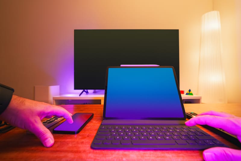
Responsive Design: Best Practices for Ensuring Cross-Device Compatibility

Responsive Design: Best Practices for Ensuring Cross-Device Compatibility

Learn about the best practices in responsive design to ensure your website looks great on any device, from desktops to mobile phones.

Responsive Design: Best Practices for Ensuring Cross-Device Compatibility

As the digital environment continuously evolves, the variety of devices that can access web content expands, making responsive design a critical component of web development. Responsive design ensures that users have a seamless viewing experience across different devices, including desktops, laptops, tablets, and smartphones. This approach adjusts the layout and functionality of websites to work efficiently regardless of screen size, orientation, or platform. Here, we discuss some best practices for responsive design that help ensure cross-device compatibility.

  • Start with a Mobile-First Approach

    Starting the design process with mobile in mind encourages simplicity and efficiency. Mobile-first design prioritizes loading speed and the essential features of a website. It ensures that the most critical information and functionalities are prioritized when space is at a premium. Once the mobile design is optimized, you can add more complex features and content for larger screens, ensuring that all versions maintain core functionality and user experience integrity.

  • Use Fluid Grid Layouts

    Fluid grids are fundamental to responsive design. They allow layouts to resize dynamically based on the user's screen size by using relative units like percentages rather than fixed units like pixels. This fluidity ensures that the layout adapts to any screen width, making the website look and function harmoniously across different devices. Fluid grids are a step away from conventional page design, which was often static and rigid, not accounting for varying screen sizes.

  • Implement Flexible Images and Media

    Just as fluid grids scale depending on screen size, images and other media should also be flexible. Use CSS to ensure images and videos resize correctly. This can be achieved by setting the max-width property to 100% and height to auto. This makes the image scale down if it has to, but never scale up beyond its original size, thereby preserving clarity and reducing loading times.

  • Utilize Media Queries

    Media queries are a powerful tool in CSS that enable web developers to apply styles based on the characteristics of the device viewing the site, such as the width of the viewport, device orientation, and resolution. By including breakpoints in CSS, your website can respond to various environmental conditions of different devices and display the content in the most appropriate way.

  • Optimize Text for Readability

    The readability of text on various devices is crucial for a positive user experience. It is important to use legible font sizes and types, appropriate spacing, and contrasting colors. Media queries can be used to adjust the text size and spacing for different devices, ensuring that the text is readable without needing to zoom on any device. Moreover, maintaining a vertical rhythm (consistent spacing between lines and blocks of text) enhances readability and aesthetic cohesion across devices.

  • Use Touch-Friendly Interface Elements

    With the increasing use of smartphones and tablets, it's essential to design for touch navigation. Ensure that buttons, links, and other interactive elements are large enough to be easily tapped with a finger. Avoid using UI elements that require precise cursor navigation, which can be frustrating on touch screens. Additionally, consider the placement of these elements to enhance ergonomics and accessibility.

  • Prioritize Speed and Performance

    Optimizing the performance of a website is crucial, especially for mobile users who may be on slower network connections. Minimize the use of heavy graphics and streamline the code to reduce loading times. Employ techniques such as lazy loading, which delays the loading of images and other non-critical resources until they need to be displayed. This significantly improves the speed with which your core content appears.

  • Test Across Multiple Devices and Browsers

    Continuous testing across a range of devices, operating systems, and browsers is essential to ensure compatibility and function. Automated testing tools can simulate various environments, but nothing can completely replace the insights gained from physical device testing. Regular updates and feedback loops based on analytics and user feedback can help refine and enhance the responsiveness of your web design.

  • Ensure Accessibility

    To create an inclusive digital space, ensure that your responsive design also adheres to accessibility guidelines. This includes providing adequate contrast, keyboard navigability, screen reader support, and alternative text for images. Accessibility shouldn't be an afterthought; integrate it into the design process from the beginning to ensure that all users have equal access to information and functionality.

  • Keep it Simple

    Last but certainly not least, simplicity in design helps ensure that your website is user-friendly across all devices. A clean, uncluttered layout with a clear hierarchy not only aids in usability but also in performance, making it easier for users to find what they need and for the site to load what is necessary.

By implementing these responsive design best practices, developers and designers can create websites that provide an optimal experience for users on any device. The key lies in meticulous planning, continuous testing, and keeping abreast of new advancements in technology and design standards. This ensures that websites not only function well across all platforms today but are also prepared for future devices and screen sizes.

Read More